Favicon UX: What Makes a Great Favicon
A great favicon is simple, high-contrast on light and dark tabs, built from your logomark, and stable over time. This guide covers the UX rules for 16x16 legibility, colour, padding, transparency, badges, performance and testing.
 Tomáš Rohlena
13 min read
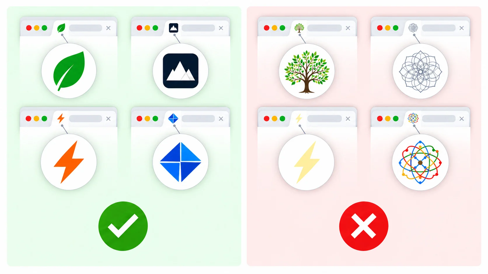
A great favicon is a simple, high-contrast mark, usually your logomark or one or two letters, that stays readable at 16x16 pixels on both light and dark browser tabs, matches your brand, and rarely changes. Everything else in this guide (pixel alignment, colour, padding, transparency, file size) serves those goals: make your site instantly findable among dozens of open tabs.
A favicon is tiny, but it shows up in many places: browser tabs, bookmarks bars, history lists, the tab-search menu, Google search results on mobile and desktop, and phone home screens. For users with many tabs open, the title is often truncated to nothing and the icon is the only cue left. That makes it a real navigation element, not decoration.
1. Legibility at 16x16
The classic favicon size is 16x16 CSS pixels. On a standard display that is literally 256 pixels; on a 2x retina display the browser usually picks a 32x32 image for the same space. Whatever you design has to survive this reduction.
Keep it simple
- One shape or one to two letters. A single bold letter, a circle with a symbol, or a simple geometric mark works. Three letters or a word will turn into noise.
- One focal point. If you cannot describe the icon in five words, it is too complicated.
- No gradients, shadows or fine textures. They become blurry smudges at small sizes.
Align to the pixel grid
At 16x16, a line positioned half a pixel off the grid is anti-aliased across two rows of pixels and looks grey and soft. Place edges on whole pixel boundaries and use even widths where the shape is symmetrical. If you export from a vector tool, enable pixel snapping, or check the downscaled result and fix it by hand.
Avoid thin lines
Strokes thinner than 2 pixels at 16x16 (about 12 percent of the icon width) tend to vanish or flicker between sizes. Thicken strokes, remove inner details, and merge small gaps. A bold, slightly heavy glyph usually reads better than a faithful miniature of a detailed logo.
Hint by hand
ICO and PNG files have no font-style hinting, so manual pixel editing is the equivalent: you adjust individual pixels so that curves, diagonals and counters (the holes in letters like "a" or "e") stay crisp. Automatic downscaling is a good first draft, but a few hand-placed pixels often make the difference between a blob and a recognisable letter. The MakeFav pixel editor is built for this: open the 16x16 canvas, correct the problem pixels, and export.
2. Contrast on light and dark tabs
Browsers now commonly run in dark mode, and many users have tab strips that differ from the page theme. A dark navy icon with a transparent background can be perfect on a white tab and nearly invisible on a dark grey one. Always test both.
Practical solutions
- Add a background shape. A solid rounded square or circle in a brand colour guarantees the mark has its own contrast, regardless of the tab.
- Use a thin outline or halo. A 1px lighter edge around a dark glyph (or the reverse) keeps the silhouette visible on either theme, but at 16x16 it must stay crisp, so test it.
- Pick mid-tone brand colours. Colours such as strong blue, orange, green or magenta typically work on both white and near-black surfaces. Very light yellow or very dark navy are the risky ones.
- Use an adaptive SVG favicon. An SVG can include a
prefers-color-schememedia query so the icon changes with the system theme.
<svg xmlns='http://www.w3.org/2000/svg' viewBox='0 0 32 32'>
  <style>
    .mark { fill: #1b2a49; }
    @media (prefers-color-scheme: dark) {
      .mark { fill: #f5f7fa; }
    }
  </style>
  <path class='mark' d='M6 26V6h6l4 10 4-10h6v20h-4V13l-4 10h-4l-4-10v13z'/>
</svg>
Note that the media query reflects the operating system or browser theme, which is usually what the tab strip follows, but not always. Support for SVG favicons also varies: Chrome and Firefox handle them, while Safari has historically lagged, so always keep PNG or ICO fallbacks. A solid-background design is the most robust option because it needs no theme logic at all.
3. Recognisability and brand consistency
Use the logomark (the symbol or monogram), not the full logo lockup with the wordmark. Text inside a 16x16 icon is unreadable, and a wide horizontal logo shrunk into a square leaves you with a tiny strip in the middle.
- If your brand has a symbol, simplify it for small sizes rather than just scaling it down. A "favicon version" with fewer details is standard practice.
- If your brand is a wordmark only, take the first letter or a distinctive pair of letters and set it in your brand typeface at a heavy weight.
- Keep the colours consistent with your logo, app icon and social avatars, so a user recognises the same brand everywhere.
Distinctiveness matters as much as fidelity. Look at a row of tabs: if three other sites also use a blue circle, yours will not stand out. A different shape or colour is more useful than a perfectly faithful reduction.
4. Colour: a limited, saturated palette
With so few pixels, every extra colour adds clutter. Aim for one or two colours plus, at most, white or black. Saturated colours carry better at small sizes than pastels, which tend to blend into the tab background.
Borrow a little from accessibility thinking. WCAG asks for at least 3:1 contrast for meaningful graphical objects (success criterion 1.4.11, Non-text Contrast). A favicon is not formally covered, since it is browser chrome rather than page content, but 3:1 between the glyph and its background, and between the icon and the tab, is a sound target. Also avoid communicating anything through hue alone: red versus green variants of the same icon are indistinguishable for many colour-blind users, so vary shape or add a symbol.
5. Shape, padding and safe zones
Fill the square
Browser tabs display the favicon at a fixed small size, so extra margin just makes your mark smaller. For standard tab icons, use most of the canvas, with only a pixel or two of breathing room, so the mark is as large as it can be.
Rounded or square?
Browsers do not generally crop tab favicons, so the shape you draw is the shape users see. A square with slightly rounded corners looks tidy and gives a consistent background; a freeform glyph or circle on transparency can look lighter and more distinctive. Either is fine. Pick one and keep your whole icon set consistent.
Apple touch icons
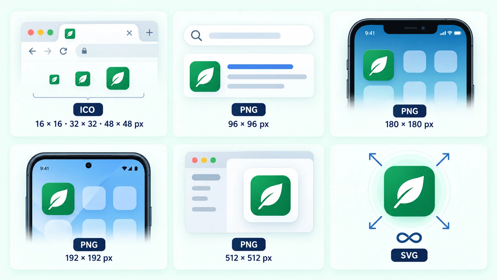
iOS adds its own rounded corners to the apple-touch-icon (180x180 is the usual size). Supply a full-bleed square with no pre-rounded corners, otherwise you may end up with visible dark or white slivers in the corners.
Maskable icons for Android and PWAs
Maskable icons are cropped by the operating system into circles, squircles or other shapes. Keep all important content inside the safe zone: a circle centred in the icon with a radius of 40 percent of the icon width. Extend the background colour all the way to the edges so any mask looks right. Do not reuse a tight, edge-to-edge tab favicon as a maskable icon, because the mask will clip it.
6. Transparency
Transparency is fine for tab favicons, and it is what lets a glyph-only icon sit cleanly on any tab colour. It is a problem for Apple touch icons: iOS fills transparent areas with a solid colour (typically black), which can ruin the design. Always give the apple-touch-icon an opaque background in your brand colour. The same goes for maskable icons and most Android home-screen use cases, where an opaque background gives predictable results.
7. Stability: do not change it too often
A favicon builds recognition through repetition. Changing it frequently forces users to relearn which tab is yours, and it also causes technical headaches. Browsers cache favicons aggressively, and Google fetches and stores them separately from your pages, so a new icon can take days or weeks to show up in search results. Google also asks for a stable favicon URL, an icon whose size is a multiple of 48 pixels (48x48, 96x96, and so on), and a file it can crawl (not blocked by robots.txt). Treat a favicon change as a rebrand-level decision, not a seasonal decoration.
8. Notification states and dynamic favicons
Some web apps change the favicon to indicate unread messages, recording status or an error. Done well, it is helpful; overdone, it is irritating.
- Use a small badge (a dot or a short count) in a corner, not a complete redesign. The base icon should stay recognisable.
- Keep it sparse. Reserve badges for events that need user action. Do not animate the icon continuously.
- Cap numbers. At 16x16 only one or two digits are legible; show "9+" or a plain dot instead of "137".
- Reset promptly when the user has dealt with the item, and restore the default icon.
- Do not rely on colour alone. A red dot should also be backed up by the page title, such as "(3) Inbox", so the information is available to everyone.
Dynamic favicons are usually drawn onto a canvas and swapped in by updating the href of the icon link element. Throttle updates, because constantly changing the favicon can use CPU and distract users.
9. Performance
Favicons are small, but they are still requests that can be done badly.
- Keep files small. A PNG favicon is typically a few hundred bytes to a few kilobytes. A simple SVG can be under 1 KB.
- Avoid bloated ICO files. A multi-size ICO with 16, 32 and 48 pixel images is enough. Embedding a 256x256 image multiplies the file size for no visible benefit in browser tabs.
- Set caching headers. Serve icons with a long
Cache-Controllifetime, for examplepublic, max-age=31536000, immutable, and use a versioned or hashed file name when you do change them. - Declare icons explicitly. Browsers request
/favicon.icoby default, so provide one even if you declare other icons, to avoid 404 noise in your logs. - Compress. Run PNGs through a lossless optimiser, and minify SVGs.
<link rel='icon' href='/favicon.ico' sizes='32x32'>
<link rel='icon' href='/icon.svg' type='image/svg+xml'>
<link rel='apple-touch-icon' href='/apple-touch-icon.png'>
<link rel='manifest' href='/manifest.webmanifest'>
If you want to generate all these files from one source image, the MakeFav favicon generator produces the standard set, and the developers page covers integration options.
10. Accessibility
A favicon has no alt text and screen readers do not announce it, so the traditional accessibility tools such as alt attributes do not apply. What does matter:
- The page title carries the meaning. Write unique, descriptive
<title>elements. Never rely on the icon to convey state; mirror any badge in the title. - Visibility for low-vision users. High contrast, a bold shape and a large mark help users who scan tabs visually.
- Colour independence. Make sure shapes or letters distinguish states, not just hue.
- Reduced distraction. Avoid flashing or animated favicons, which can be a problem for users sensitive to motion.
Favicon UX checklist
| Criterion | Recommended value | Why it matters |
|---|---|---|
| Content | Logomark, or 1-2 letters | Text and complex logos are unreadable at 16x16 |
| Minimum stroke width | 2 px or more at 16x16 | Thin lines blur or disappear |
| Pixel alignment | Edges on whole pixels, hand-tuned 16x16 | Prevents soft, grey anti-aliasing |
| Contrast with tab | Readable on light and dark tabs; about 3:1 or better | Dark mode is widespread |
| Background | Solid shape, or outline, or adaptive SVG | Keeps the mark visible on any tab colour |
| Palette | 1-2 saturated colours | Clean look; stands out in a row of tabs |
| Padding (tab icon) | 1-2 px margin, fill the square | Makes the mark as large as possible |
| Maskable icon safe zone | Content inside circle of 40% radius | OS masks will not clip the logo |
| Apple touch icon | 180x180, opaque, no pre-rounded corners | iOS adds corners and fills transparency |
| Google size | Multiple of 48 px, stable URL, crawlable | Eligible for search results display |
| Formats | ICO (16/32/48) + SVG + PNG fallbacks | Broad browser support |
| File size | Under a few KB per file | Faster loads, less bandwidth |
| Caching | Long max-age, versioned file names | Fewer requests; controlled updates |
| Change frequency | Rarely, only for rebrands | Recognition and search cache stability |
| Badges | Simple dot or 1-2 digits, used sparingly | Legible and not distracting |
Testing checklist
Do not trust the large preview in your design tool. Test the real icon in real conditions:
- Multiple browsers. Check Chrome, Firefox, Safari and Edge, as each picks icons and sizes slightly differently.
- Light and dark mode. Switch the OS and browser theme and look at the tab strip each time.
- Retina and standard displays. Check on a 1x monitor and a 2x or 3x screen, and zoom in the browser.
- Bookmarks bar. Bookmark the page and see whether the icon is still legible next to other sites.
- Many tabs. Open 20 tabs and see if you can find yours at a glance.
- Google SERP preview. Check a mobile search result once the icon has been recrawled. Remember it may take time to update.
- Home screen. Add the site to the iOS and Android home screens and confirm the icon is not clipped, has no black corners, and is not too small within its mask.
- Technical check. Run your domain through the MakeFav favicon checker to confirm the files exist, return a 200 status, have the right sizes and are declared correctly in your HTML.
A practical workflow
- Start from your logomark and simplify it to one shape or letter.
- Create a square canvas with a solid or shaped background that works in both themes.
- Export the 32x32 and 16x16 sizes and refine the small version by hand in the pixel editor.
- Generate the full set (ICO, PNG, apple-touch-icon, manifest icons) with the generator.
- Add the link tags, set cache headers, deploy, and verify with the checker.
A favicon is one of the smallest assets on your site and one of the most frequently seen. A few careful decisions about contrast, simplicity and consistency make it work in every tab, theme and device.
Frequently asked questions
What size should a favicon be?
Design for 16x16 and 32x32 for browser tabs (the browser uses 32x32 on high-density displays), provide a 180x180 apple-touch-icon for iOS, and 192x192 and 512x512 PNGs for Android and PWAs. For Google search results, use a square icon whose size is a multiple of 48 pixels, such as 48x48 or 96x96. An SVG source scales to all of them.
Should I use my full logo as a favicon?
Usually not. Full logos with wordmarks are too detailed and too wide for a square 16x16 icon. Use the logomark or a monogram of one or two letters, and simplify it so it stays recognisable when tiny.
How do I make a favicon work in dark mode?
The safest approach is to give the icon its own solid background shape or a contrasting outline, so it does not depend on the tab colour. Alternatively, use an SVG favicon with a prefers-color-scheme media query to swap colours, and keep PNG or ICO fallbacks for browsers that do not support SVG icons. Always test in both light and dark themes.
Why is my new favicon not showing up?
Browsers cache favicons for a long time, and Google stores its own copy, which it refreshes on its own schedule, often taking days or weeks. Hard-refresh the page, clear the browser cache, use a new versioned file name, and make sure the link tags and a root /favicon.ico point to the right file. You can verify the setup with the MakeFav checker.
Is it a good idea to show notification badges on a favicon?
Yes, if used sparingly. A small dot or a one- or two-digit count helps users notice something that needs action, but constant animation or large numbers hurt legibility and attention. Always mirror the state in the page title, restore the default icon when the item is handled, and do not rely on colour alone.
Related articles
Create your favicon in seconds
Free favicon generator with ICO, Apple, Android and PWA icons.
Open the generator